
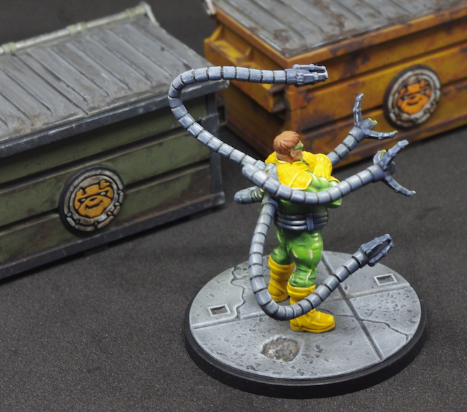
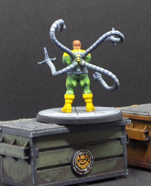
Whilst not my favourite of the Marvel: Crisis Protocol miniatures to paint, I do quite like the way he turned out, but boy, did he give me a headache!
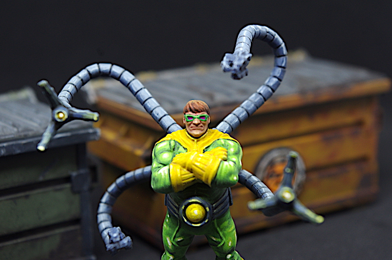
I went with the standard colours for the Doc, and when you look at him that’s pretty much yellow and green. Knowing that I’d be using these colours I went with a lighter mid-tone of Stonewall Grey (VGA – key at end) when Zenithal priming and sprayed at a lower angle than usual, which I also did with the final highlight of white. The hope here was to give a much brighter appearance to the colours and make them easier to apply.
Yellow! Yep, that’s where it all went wrong, at least in the first instance, as I initially used Iyanden Yellow from GW’s contrast range. This was a mistake right from the start and if I’d have given it more thought I wouldn’t have used it. The areas it was applied to were just too flat and undefined to get the best from a contrast paint, but that wasn’t the main issue; I just didn’t like the colour!
The recess colour it gave was far too orange for my liking and because the areas were too flat it wasn’t confined to the recesses, so what to do?
In the end I went over it with Heavy Goldbrown (VGEO), then layered up with Gold Yellow (VGC). The highlights were blocked in with Ivory (VMC) and the whole area glazed over with Medium Yellow (VMA) plus some glaze medium. It did the trick, but I wish I’d done it from the start!
The green was built up in a similar manner starting with a base of Goblin Green – yes, I still have some of GW’s old citadel range! The shadows were blocked in with Heavy Green (VGEO) and the first highlights with Escorpena Green (VGC). Further highlights were added using Dead Flesh (VGC) and finally Ivory (VMC). Glaze medium was added to each of these colours until they were nice and thin and used them to blend everything together… to an extent.
It’s always good to try something new out and so I thought this would be a good time to experiment with blocking shadows and highlight colours in before glazing. I’ve seen a number of different ways of doing this but went with applying the mid-tone to the area first and then painting a ‘blocks’ of colour where I want the shadows and the same for the highlights. These blocks are then blended together using glazes. I found it best to mix the two colours (the mid and the shadow, say) together and making a glaze out of that to blur the edges of the blocks together. A glaze can also be applied over a lighter colour, for instance Goblin Green over Ivory, to produce a brighter version of the yellow.
It was a nice break to paint his face and hair; the purple lenses were an added after I spotted them on someone else’s Doc Oc, possibly Sorastro‘s.
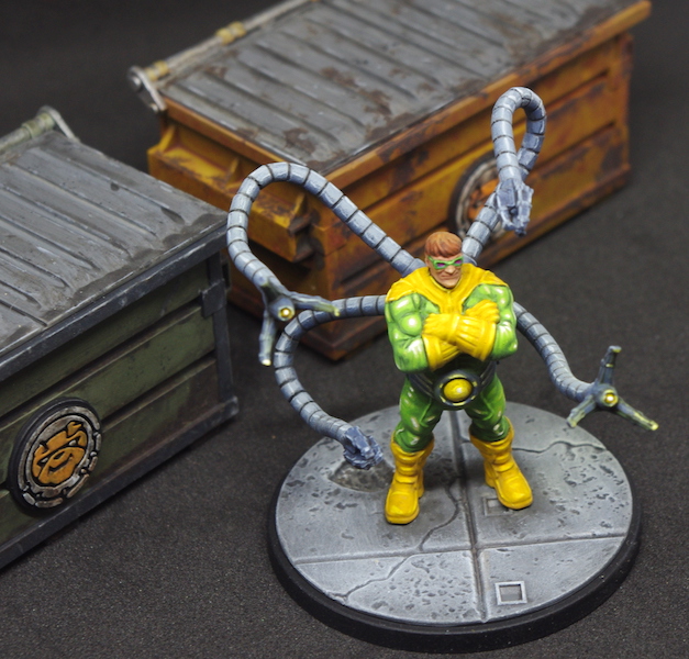
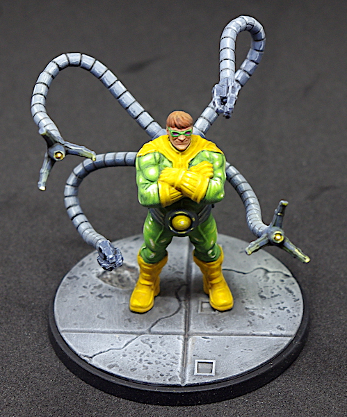
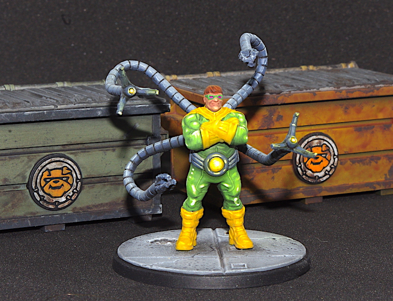
The tentacles were a bit of a chore, though looking at my notes again, it appeared that I painted Doctor Octopus’s testicles instead – my writing really is that bad!
The little bits of Object source lighting were added at the end, using the yellow glaze through the airbrush, and the base was drybrushed Pale Grey Blue (VMC) and Ghost Grey (VGC) over a base of Cold Grey (VGC) washed with Nuln Oil (GW).
And that was Doc Oc…
Key
- VGA – Vallejo Game Air
- GW – Games Workshop
- VGEO – Vallejo Game Extra Opaque
- VGC – Vallejo Game Colour
- VMC – Vallejo Model Colour

He looks brilliant, Justin, well done! 🙂 Yellow looks fine to me! I’ve started using VMC golden brown (I think that’s the one) where I don’t need bright yellow, as it covers well!
LikeLiked by 1 person
Thanks, John.
Yeah, the Vallejo extra opaque range actually do what they’re supposed to, at least most of the time, and the Goldbrown is a great base for brighter yellows, or, as you say, when you want something a little less vibrant – it rescued me here!
LikeLiked by 1 person