
I love the character of Drax in the Guardians of the Galaxy movies, though I much prefer to try and keep my characters representative of the comics, and it was there I turned for a colour scheme.
I have only one memory of him from the comics and it’s a recent(ish) one, this one…
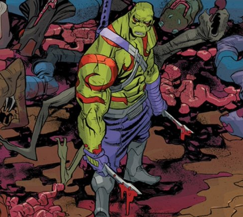
I was searching through the web, as you do, looking for inspiration when I came across the above image and instantly thought, I’ve seen that somewhere before. I have a couple of boxes full of comics and I was sure it was in there somewhere but try as I might I was blowed if I could find it. I think it’s from the later comics, 2015-16, but I don’t know for sure. Anyway, this is what I decided to base my Drax on.
I’ll start by saying, I’ve never had to repaint parts of a miniature so many times before. Boy! Did this colour scheme give me nightmares!
His skin and tattoos proved the easiest part, which I was surprised at. His flesh was built up using four base colours – Heavy Green, Snot Green, Goblin Green, and Escorpena Green – and then a mix of these to blend. After a bit of advice from Jeff (Kuribo), I went back and darkened the shadows a little to give more contrast. The tattoos were based with black and built up using Blood, Antares, and Aldebaran reds from Scalecolor, leaving the edge black for definition.
My problems started when I turned to his trousers and boots. For his trousers, I originally went with Heavy Violet layered up with Alien Purple and Heavy Warmgrey, and they did look pretty similar to the comic image above, so I was pleased with that. Then I did the boots and greaves, which, as you can see in that image, are grey. I used a base of Pale Blue followed by a blue wash, then layered up with Pale Blue and Bale Grey Blue. I wasn’t so happy at this point!

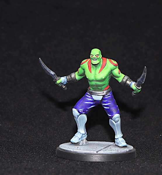
Whilst I was pleased with the individual elements, they just didn’t work together, it all clashed. I didn’t think the trousers, which were violet, and quite a bluey-violet at that, worked with the green flesh, and the grey boots didn’t work with the colour of the trousers either. So, I glazed over the trousers with Vallejo Violet ink, which is more of a purple leaning more towards red than the Heavy Violet, at least in my opinion. Interestingly, in the the photos the trousers look blue, but sat here looking at the actual figure they look purple with shades of blue – who says the camera never lies!
Whilst I was happier with this, the glazing had reduced the contrast, so I went over the shadows with Blue Ink and highlighted with Pale Blue. It now didn’t resemble the colours of the original image, as it had done before, but I felt the purple worked better with the green, however, the boots and greaves were not right at all, they were far too light in colour.

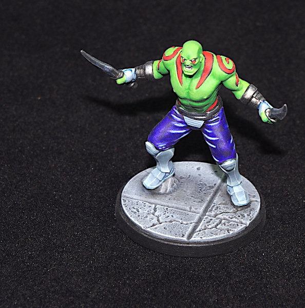
In the end, I darkened them using glazes, first Dark Blue Grey and then added some Grey Blue to darken things further. A final edge highlight of Pale Grey Blue and I was done.
I’m still not convinced the colours all work together, but then, when I look at the original comic image, I don’t think they work there either. The green flesh with the violet trousers and the grey boots, I dunno, it just looks odd to me.
One last thing. Every time I look at his face, I want to dot those eyes, but in all the comic images I’ve looked at he doesn’t have pupils, and so I keep resisting the urge!


Great work on Drax Justin, it can be hard to match colours, and frustrating when the colours don’t work together, even though that’s what’s on the reference image, sometimes you just have to say, I’m going to do what makes me happy.
LikeLiked by 2 people
Lol, you’re so right there, thanks Dave.
I’ve never been good at creating my own colour schemes and nearly always follow something as a guide, and yes, it can be frustrating when I can’t capture what is in front of me. Still, it’s all good fun 😃
LikeLiked by 3 people
On the one hand I can see where you’re coming from about the clashing colours, but on the other hand who gives a shit? Just look at the amazing job you did on Drax’s skin tones, and those tattoos are excellent. Fantastic painting again, matety, well done!
LikeLiked by 3 people
Cheers Matt😁
Yep, I’m really pleased with how his skin turned out and I think he’ll look great on the table – I’ll find out in a couple of days, as we have a game or two lined up🙂
LikeLiked by 2 people
The extra time you put into the skin is really well-spent. Drax’s belly is magnificent! 😀 Really almost all of the mini is excellent at that.
I would say that I think you can do a bit better on the pants or trousers as you Brits call them 🙂 I would recommend a little bit colder of a blue like in the comic book image of Drax above. You could potentially use The Fang (if you like GW paints) and the two respective highlight colors they use for the pants. More importantly though, the bright highlights on the pants are a little too bright. I would build them up gradually with a blue color that gets lighter and then gets closer to white like you have it near the where the light is hitting them the most. I think that will really bring this mini together. Of course, it looks great already and I wouldn’t blame you if you didn’t want to sink more time into it either! 🙂
LikeLiked by 4 people
Cheers Jeff. I’m really pleased with how the skin turned out – thanks for the advice – but I let myself down with his “pants!”
They looked way better the first time I did them, but the colour just wasn’t right. By the time I’d repainted them a couple of times I just wanted to get done. I should have left it and returned after doing something else, but we’ve a game lined up this week and I still need to get Kingpin finished; you know how it is!
The highlights don’t look quite so bright in reality. The images aren’t replicating the true colours of the trousers and it makes the highlights stand out more, but I do agree, I should have built up to them gradually.
It’s rare I revisit a mini (so rare I’ve never done it), Once done they’re there to be played with and from then on I never think about it. Maybe, if one was so bad it grated on me every time I looked at it, I would, but I’m usually too focused on the game in hand😉
LikeLiked by 2 people
Its never easy to paint when you’ve got a deadline, that’s for sure! I think the pants are not far off from where you want them to be but having said that, I wouldn’t sweat revisiting this one either. I rarely, if ever repaint anything and I think its better to focus on the next miniature you’re going to paint than trying to correct or improve your work of the past 🙂 There is some expression I’ve heard that with each mini that passes through your hands, you improve and I think there is truth in that!
LikeLiked by 2 people
That’s a great expression Jeff – best I pull my socks up and start knocking ’em out then!😉
LikeLiked by 1 person
Good work, and you’re certainly wise to heed Kuribo’s advice. I actually rather like the trousers and boots, I think that your painting of them gives a very cartoon appearance which is very fitting.
LikeLiked by 1 person
Thank You.😁
Guru Kuribo’s sage advice is always worth heeding🙂
LikeLike
Nicely done, Justin! 🙂 Definitely not a scheme I’d have been happy with painting, but it’s come out really well!
LikeLiked by 3 people
Thanks John – it wasn’t a scheme I was happy painting either😁
LikeLiked by 1 person
Great work on Drax here, Justin! I do agree that the original colours choices for the character are a little questionable, but you did manage to pull it off in a way that looks good (especially the skin tones), and the tattoos really elevate the rest of the model quite nicely. 🙂
LikeLiked by 3 people
Thanks Azazel.
I’m really very pleased with the skin and I try not to look too closely at the rest!😉
LikeLiked by 2 people