
It’s been some time since I did a dedicated painting post, and I could write several about the figures I’ve painted in the meantime, but I thought I’d miss that lot out and come right up to date with my most recent offering – Luke Cage.
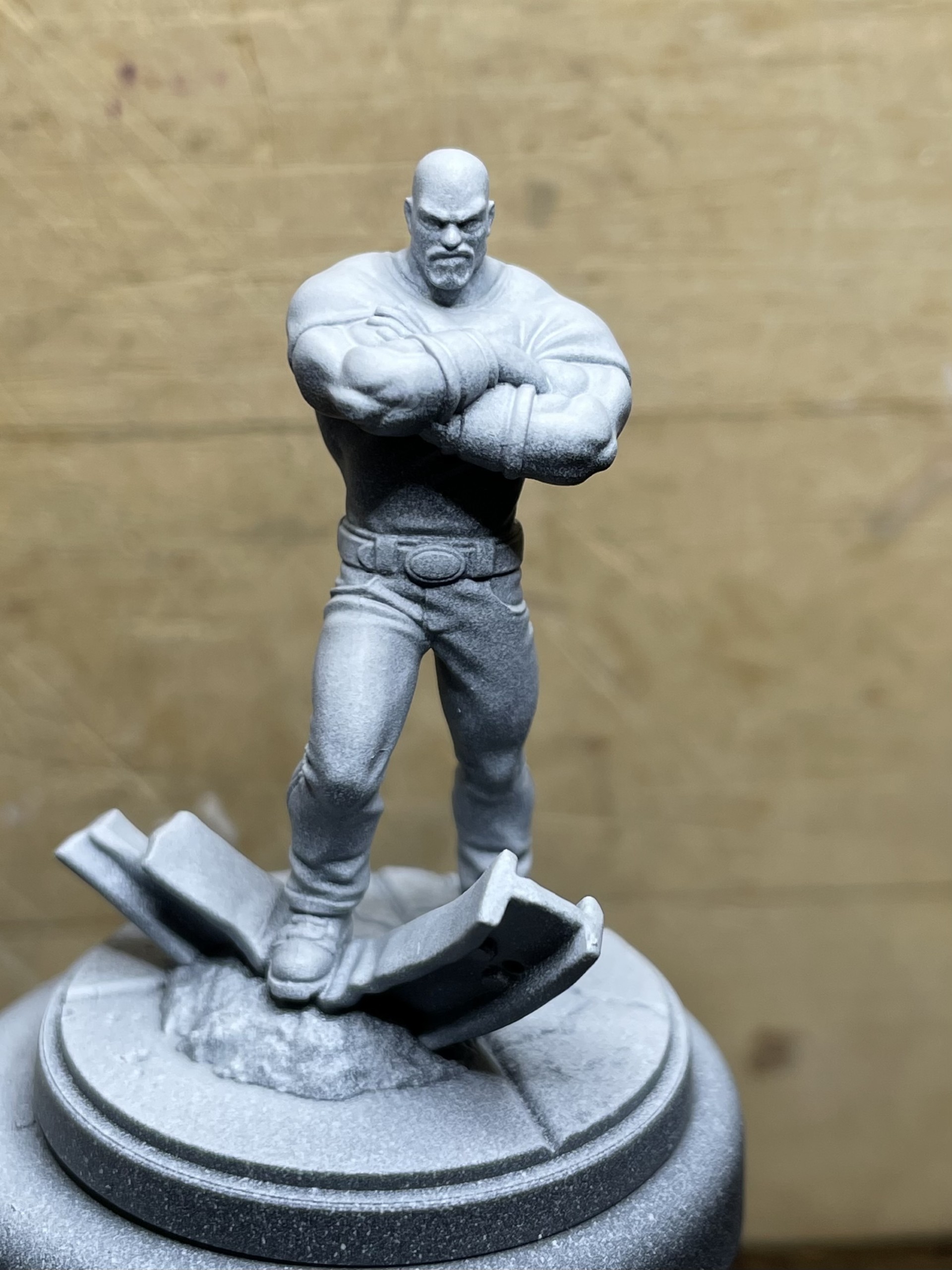
I’m still experimenting with Vallejo’s Xpress range and the few GW Contrast paints that I have, and was looking forward to trying to paint Luke’s dark skin with them. With this in mind, I zenithal primed him – Black, Stonewall Grey (still trying to find the best mid-tone grey for this), and white.
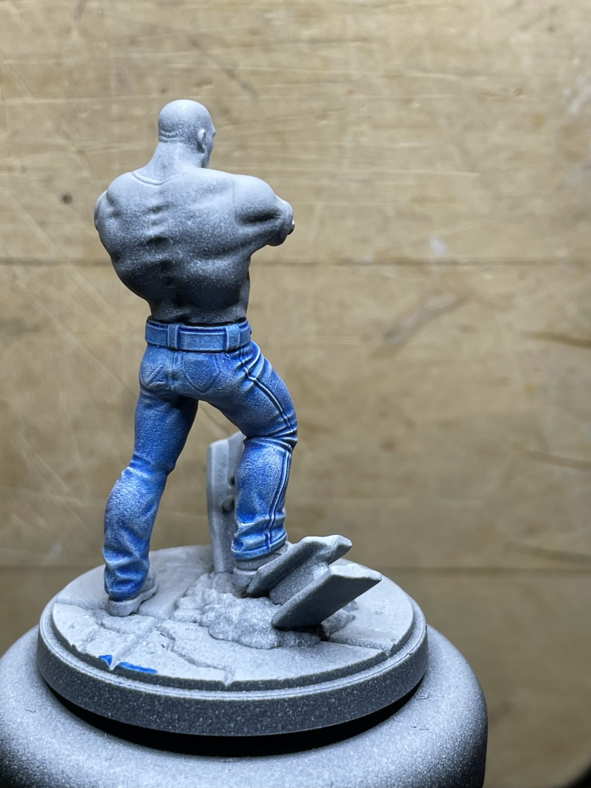
For his jeans, I used a thin coat of Blue Ink followed by a drybrush of white to make them look a little worn.

His shirt was next, and for this I used Vallejo’s Imperial Yellow Xpress paint. I applied a coat and then drybrushed white to pick out the highlights. I then applied another coat of Yellow. I repeated this process several times until I was happy with it (I could have gone on all day!).
These photos don’t show the highlighted areas very well, but once the skin is fully finished they do stand out more (see later images).


Now, it was time to start on the flesh!
To begin with, I applied a coat of Darkoath Flesh Contrast paint.
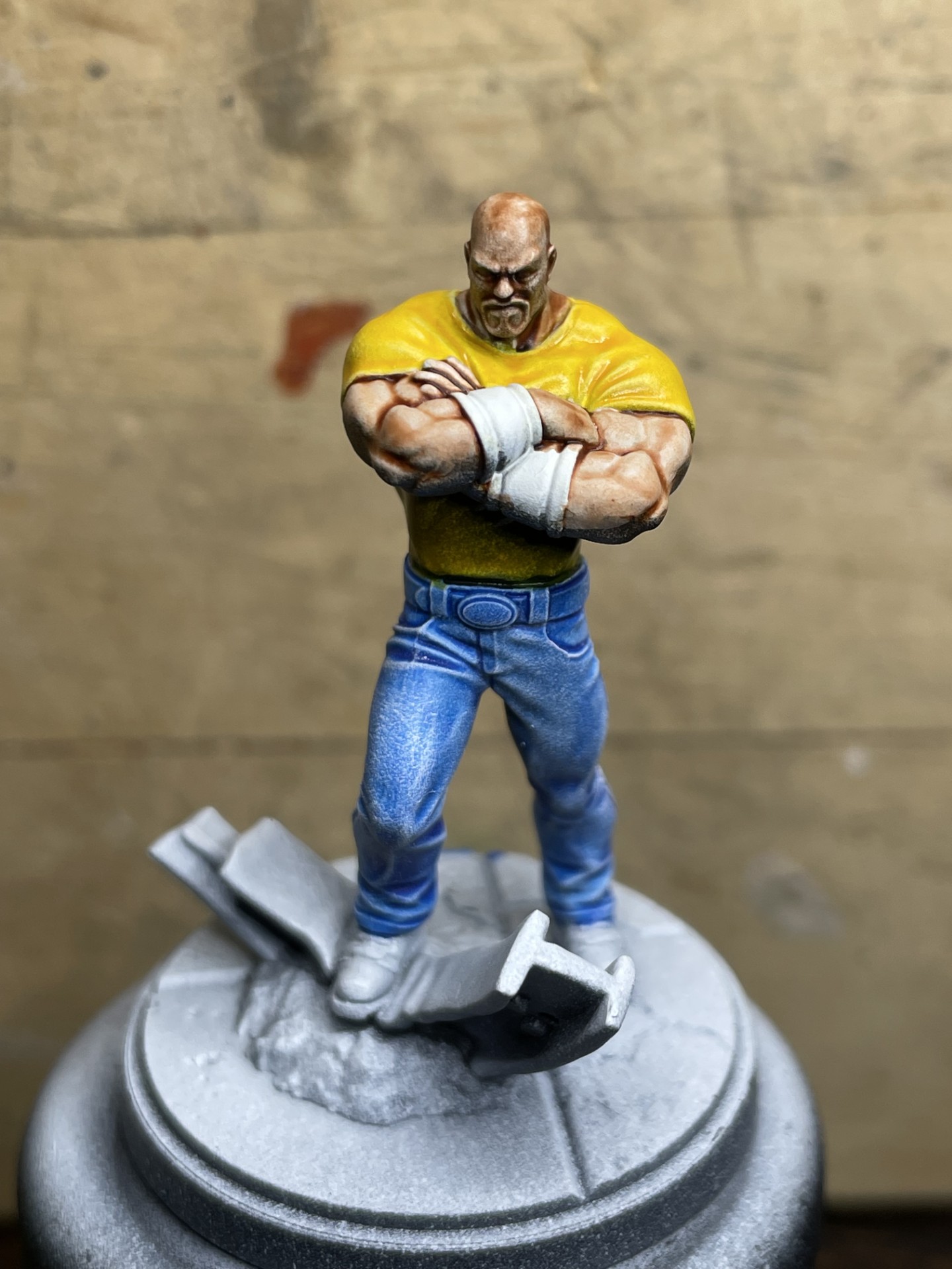
Next, went on a coat of Skeleton Horde Contrast.

Getting there, but the shaded areas on his arms weren’t very neat and looked like a badly applied wash!
It’s what I expected, as I’ve used this technique to paint dark flesh tones before and knew what I was going to do next to bring it together. I started applying a Bonewhite glaze, building up the highlighted areas and blending in the shaded ones. I then applied another coat of Skeleton Hoard. I repeated these steps until I had the shade of flesh I was looking for.
Whislt waiting for the coats of Contrast to dry, I basecoated his bracelets and the girder with Gloss Black and then again with Metal Color Steel.
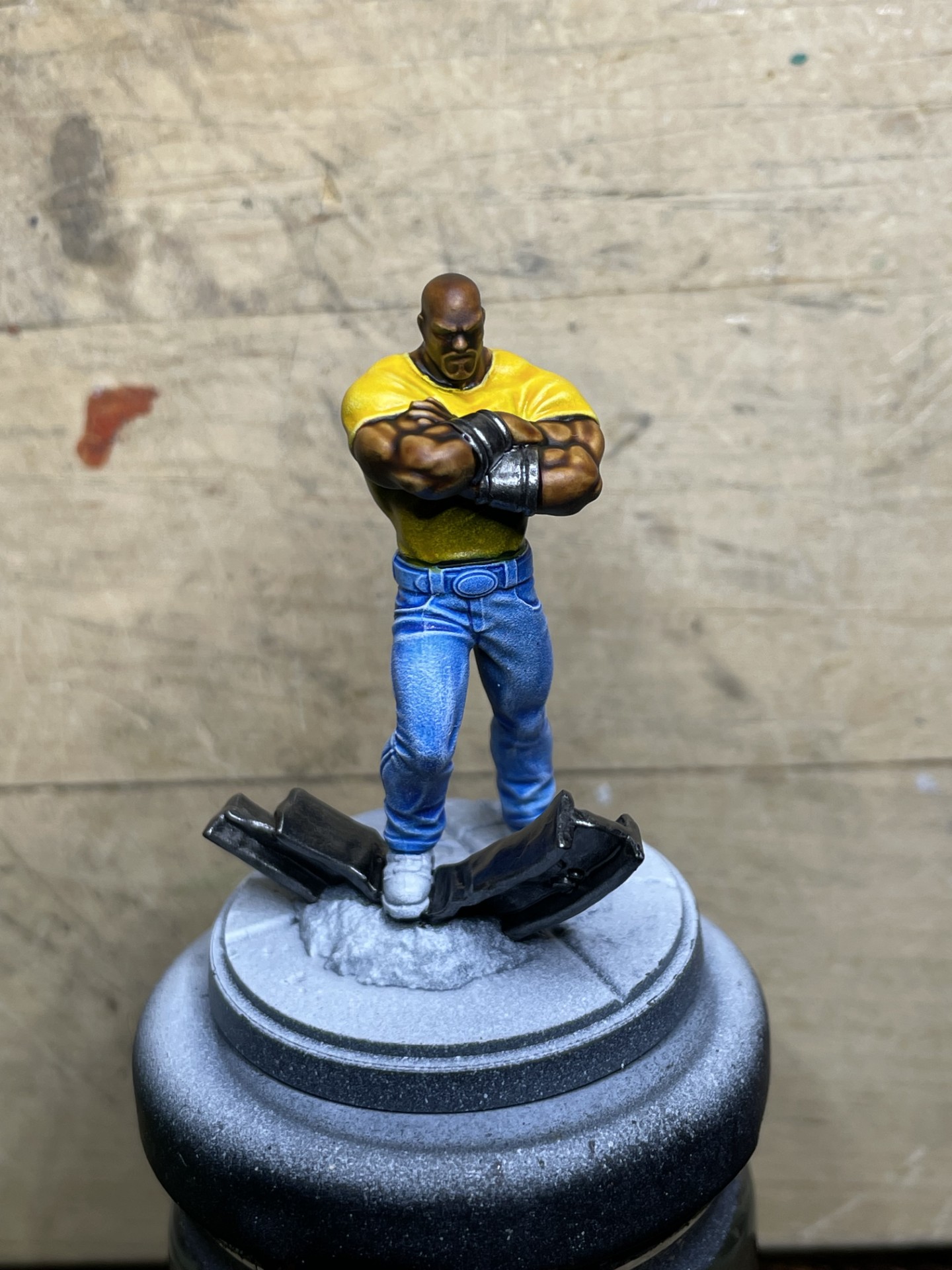
From here, it was just a case of adding the details to face, washing over the bracelets, and adding the weathering effects to the girder. Oh! and finishing the base, which I didn’t do much of a job on, once again, despite me previously saying I was going to put more effort in to bases!


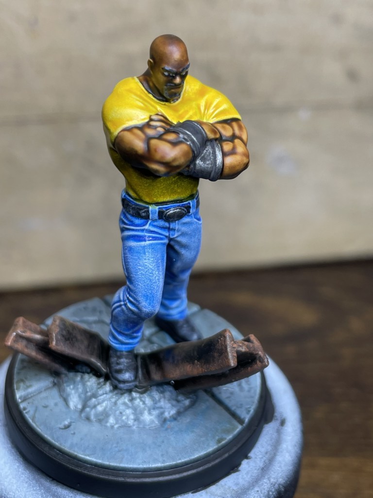
I know some people aren’t fans of the Contrast over Zenithal look, but I don’t mind it if used sparingly. Here, I only really get that ‘grainy’ shading look that it gives on his shirt, which doesn’t look so great close up, as in these images. At gaming distance, though, you don’t notice it at all and it provides a good degree of contrast for little to no work – it’s a pay off between time and quality.
I have decided to go back and do a little more on the base, as I really should try to push myself in to doing more on them. Maybe, I’ll grow to like doing bases some day… but don’t hold your breath!

Very nicely done – He is on my short list of characters I would add to mt MCP collection, should I ever play again.
LikeLiked by 3 people
Thanks Eric.
I haven’t been able to keep abreast of what everyone’s been up to just lately, but it sounds like you’ve not been playing MCP. Any particular reason?
LikeLiked by 2 people
Just no-one to play with. It ran its course like Malifaux and fizzled. I’ve been trying to get in some solo play on Forbidden Plasm one a month or so. Weirdly I’ve gotten bitten by the Gaslands bug.
LikeLiked by 3 people
Yeah, I know what you mean.
Since Yasmin left for Uni I’ve barely played anything at all 😞
LikeLiked by 2 people
Great work on Luke, the multiple layers on his flesh really paid off. As for the dots, there are some of the top painters that highlight with dots so I wouldn’t worry too much about it, as long as you are happy with the results.
LikeLiked by 2 people
Thank you, Dave.
Certainly happy with him and I don’t mind the look when to be honest. It works well for pieces that will be used for games and usually viewed from above at arms length. I don’t usually use the technique for leaders or more prominent figures though.
LikeLiked by 1 person
Very interesting process, me ol’ mucker! I think the results speak for themselves and the denim look of the jeans is spot-on too.
If you’re looking for some feedback, I’d recommend figuring out a way to highlight the face a little more as highlights on the face draw the viewer’s attention to it which is what we as the painter generally want. As it stands now, the highlights on his arms are stronger than the face and so they draw my attention there more than the face.
Time permitting, I think it would be interesting to see more articles like this in the future but then again, I’m a bit of a painter’s painter and enjoy talking and thinking about technique, if you know what I mean 🙂
LikeLiked by 3 people
Thanks for the feedback mate, and you’re absolutely right!
I’ve taken a good look at him, and in terms of actual contrast, it’s the same on his face as his arms, but the areas of highlighting are much smaller and so I think I’d be right in saying I should take them up a level in contrast to make them stand out further, would you agree?
I will post more like this, as it’s pretty much all the images I post to Facebook as I’m going a long. I just put them in a single post here, and it didn’t take much time to add a bit of a write up, so hey, it’s a winner for me, lol!
LikeLiked by 1 person
I just took a close look at yours and the studio version to help me see what the sculpt looks like and I would say the studio version is a pretty good example to work off of. I’m going to more or less recommend you copy it as they got everything right in my eyes.
It looks like you gave him eyebrows which is normally smart and a good thing to do but I think you actually might want to just skip them and repaint that small area as highlighted skin. I would also go back and brighten the area just under the shadow of the eyes with a similar skin tone to the brow area too. And finally, I would apply brighter highlights on the top of his head like they did. That should really draw attention there and off of his arms. The crown of the head on a bald person is likely to be one of the brightest areas of skin since its closer to the light. It will probably take some glazing to make his head look smooth, just so you know as well. I hope this helps and if you have any questions, don’t hesitate to ask!
I like the sound of more posts like this and I’m looking forward to them! 🙂
LikeLiked by 1 person
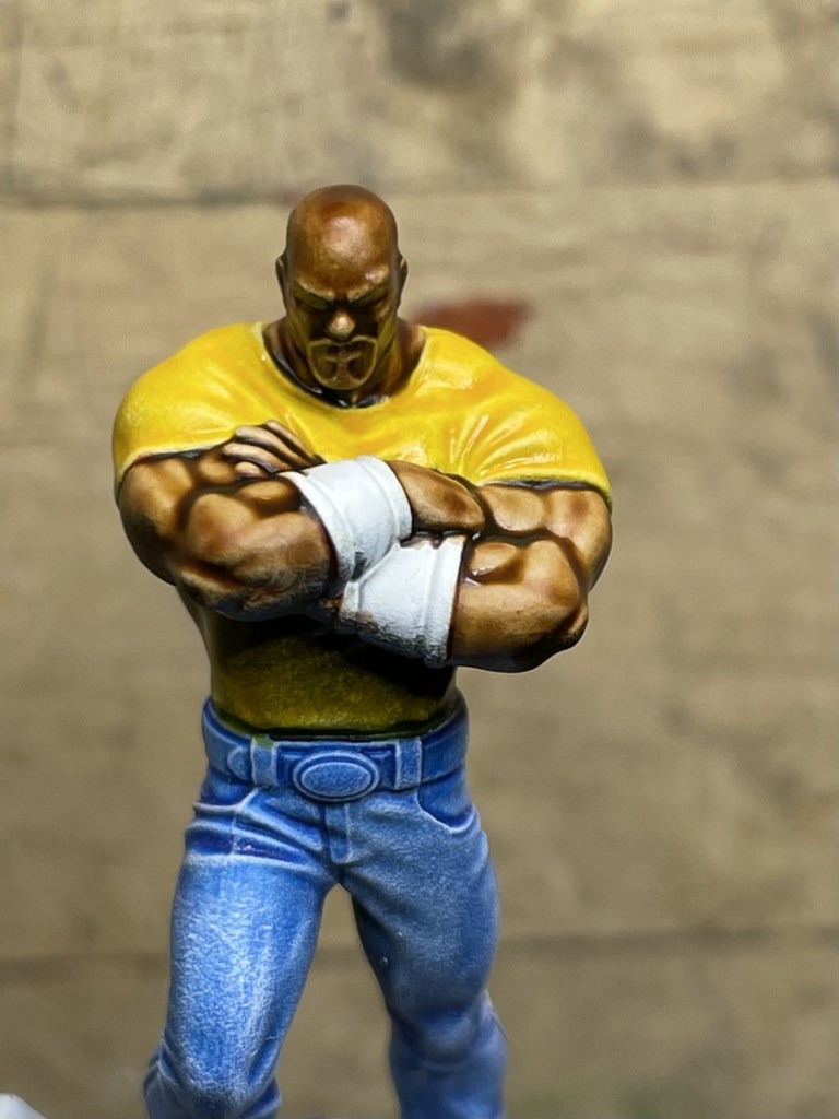
Jeff, thanks mate, for the advice and I gave it a go…
But… there’s always a but!
I started glazing in highlights, as I had before, but I’m using contrast paint over that to blend in and give the tonal colour.
The highlights worked quite well, however, because I’ve used more layers of contrast on his head, it now appears a different, more chocolate brown colour, when compared to his arms, lol!
I kept the eyebrows, though, as highlighting up around the eyes made them more pronounce.
I’ve stopped tinkering with him now, and I’ve learnt a few lessons, which, to be honest, I already knew but didn’t follow.
Highlight further than I think, always an issue, and think about the focus of the model. Oh! and always use the same amount of coats of contrast over the entire area, otherwise it appears a different colour!
LikeLiked by 1 person
Glad to hear that the advice helped overall and I make mistakes on pretty much everything I paint. Painting perfection is very difficult to achieve, unfortunately!
I didn’t think to mention it but I think you may have come across one of the downsides/weaknesses of Contrast paints. They make it hard to make changes to a paint job after you apply them and they’re slightly finicking to apply as well. I don’t have a huge amount of experience with them but if you like using them, you could apply them and basically let them be your shadows and then apply a base color of a regular paint over many parts of the miniature before you move into highlighting which would also use non-Contrast paints. That helps you solve one of the biggest challenges of Contrast paints which is less control over the layers and blends. Its also much harder to fix mistakes with Contrast paints, in my experience, if you don’t revert to some of the traditional painting techniques like I described. That’s why I don’t use them all that much other than for low quality sculpts where saving time is the most important thing. I hope that information is helpful and I’ll stop yammering on about paints and techniques for now 🙂
LikeLiked by 1 person
Very nicely done, Justin! 🙂 All of it, nice jeans, nice yellow top and nice flesh tones! I really like him!
LikeLiked by 2 people
You’re too kind John, thank you very much😉
LikeLiked by 1 person
Terrific painting, I love this. The jeans, the yellow t-shirt are just perfect. And I’m so impressed with the face – the beard and even the eyebrows just work.
LikeLiked by 1 person
Thanks mate.
I do agree with Jeff, though, that the highlights on the face should have been stronger to draw attention to it rather than his arms, as muscley as they are!
LikeLike