
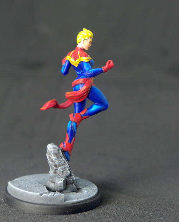
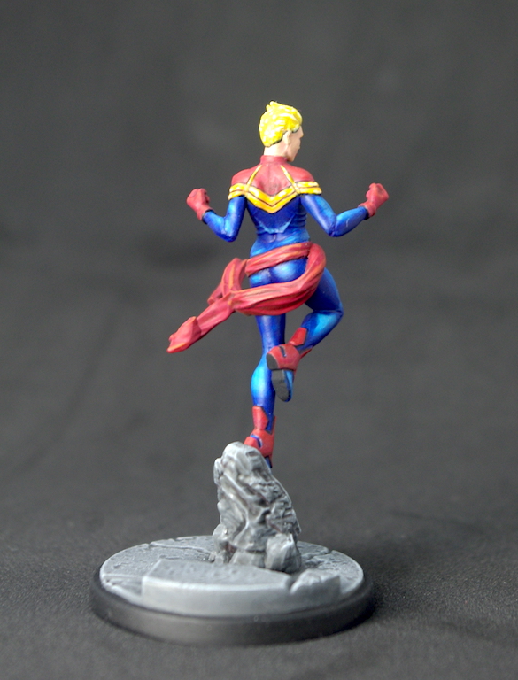
This is one model I really enjoyed painting and it only took me a few hours, unheard of for me. It’s quite an open pose, so there were no tricky bits to get to, and it really came down to three base colours, red, blue, and yellow.
I took a few more pictures as I went along than usual, so I can show the stages I went through, at least to some degree – some were taken on my phone so apologies for the quality.
Let’s kick off and look at the process…
Started off, as always, with zenithal priming. I tend to use Black primer (Vallejo), Cold Grey (VMA – Key at end of post), and White (VMA), unless the majority of the miniature calls for something different, such as with Iron-Man.
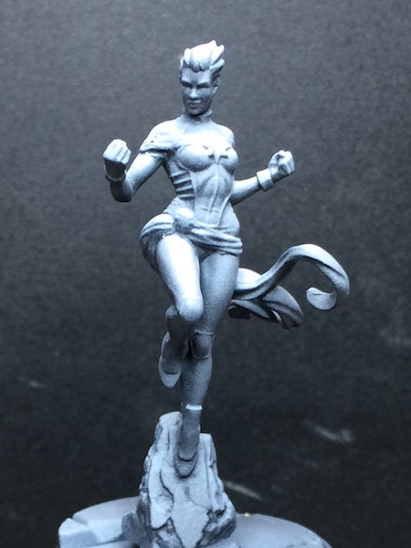
Next, I laid down the base colours. I don’t always do this, it really depends upon the mini, sometimes I concentrate on a particular area and paint it to completion, especially if it’s a tricky to get to bit.
I started with a glaze of Blue (VMA). Just a single thin coat, which, over the zenithal priming, created tonal variations in the blue, both darker and lighter than the applied colour. I’ll talk about the advantage of this shortly.
The red and yellow were just straight coats – Mechrite Red (GWO) for the red, obviously, and Heavy Orange (VGCEO) with a little Gold Yellow (VGC) added for the yellow areas. No glazing here, I’d decided to just use layers. I also did a little lining in at this point, as any mistakes can be rectified in the next stages – I went back over a little later with the base colours to make sure the lines were nice and thin.
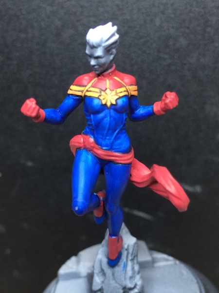
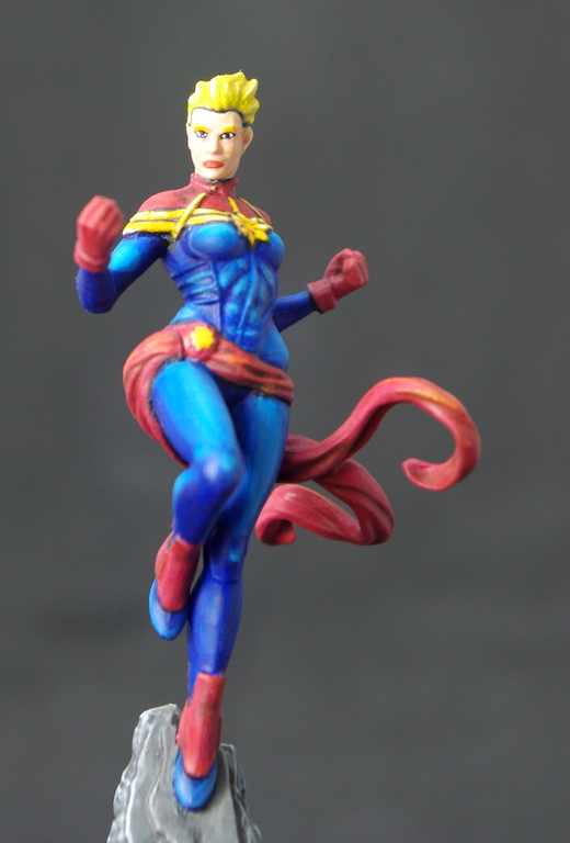
With the main colours down, I started on the face. I’d decided I was going to go with rather pale features with bright blonde hair to draw the eye up. So, the face was based with Elf Skintone (VGC) and the hair with Bronze Fleshtone (VGC). I added a thin black line around the hair to differentiate it from the face, otherwise the colours sort of become one.
Unfortunately, I stopped taking pictures at that point. I got focused on what I was doing, and time just went; before I knew it, I’d finished her!
Anyway, here’s the next steps…
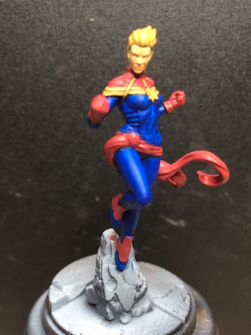
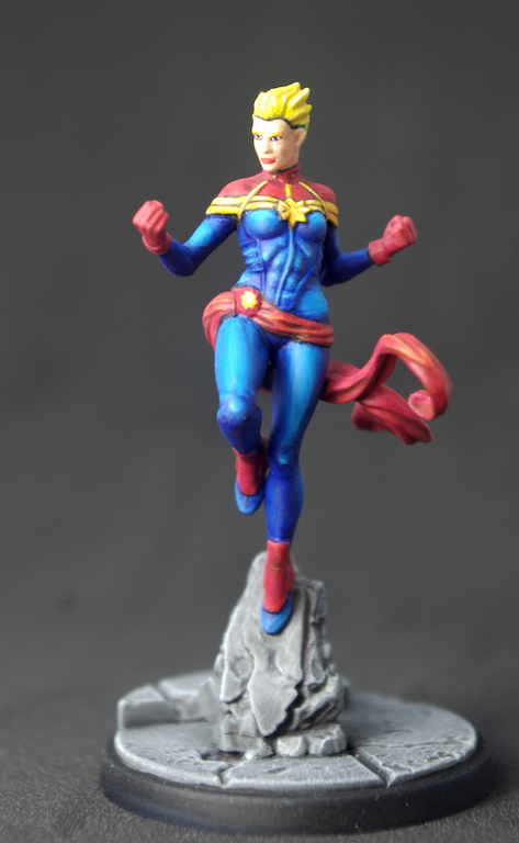
Returning to the blue suit, I can talk about the advantages of glazing over zenithal priming. Having put down a single thin layer of Blue, the zenithal gives it brighter and darker areas as it coats the three different colours used in the priming. The black supplies the shadows, slightly tinted blue. Over the cold grey the blue is close to what it is straight out of the bottle. And over the white we have a highlight of bright blue.
So, to part of my original glaze I added a tiny amount of Electric Blue (VGC). This was applied over the areas where the white priming showed there to be highlights. It takes many coats for the Electric Blue to start standing out, and by adjusting the area I applied it to I get a gradual change from one colour to the other – I used the original glaze to darken it again if I was unhappy with it. Well, that’s the theory at least, but it takes practice and I’m still on the lower rungs of that ladder at the moment.
I find it an enjoyable way of painting, as you’re constantly adjusting and playing with the paint. One thing I have learnt, though, is don’t overload the brush with glaze. I usually wipe the excess off before I apply it otherwise I don’t get a nice even thin layer, instead I end up with it being thicker where I lift the brush at the end of a stroke.
Using Gore Red (GWO) I started picking out the shadows on her sash and the top part of her suit. I wanted something a little darker and so added some Mahogany (VMA) to it. I went further still for the darkest recesses and used neat Mahogany. To highlight I started with Red (MA), then added some Orange Fire (VGC) to it. I increased the amount of Orange fire and continued highlighting until it was almost neat orange… I may have gone a little too far, but I think I got away with it!
Yellow is a bit of a bane for me, though I think I’ve finally come up with a way to do it. With the base colour laid down I just highlighted up from there. Gold Yellow (VGC), then Moon Yellow (VGC) and then Moon Yellow with a little White added. With the lining in around it I think it makes the yellow pop.
I wanted the hair brighter than the yellow on the suit, so I started highlighting with Sunburst Yellow (GWO). I then added some areas of Dead White (VGC) and went over them with the Yellow. The white brightens the yellow and when I added a final highlight of Dead White it also tied the two colours together.
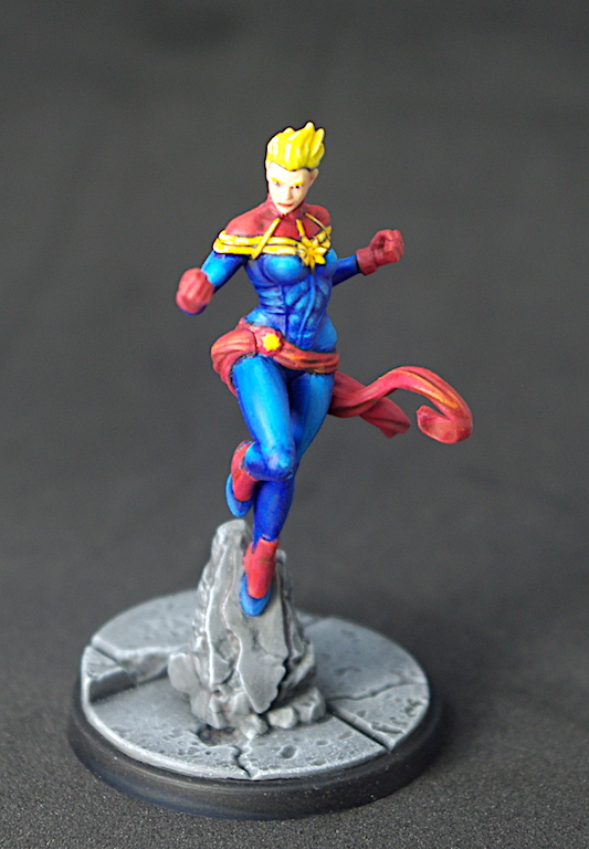
Finally, the face. I made a glaze from the original base colour, Elf Skintone, and also made glazes of Tan (VGC)/Pale flesh (VGC), for the mid-tone, and Elf Skintone/Dead White for the Highlight. It was then just a case of playing around with the glazes to get what I wanted. Not a lot of actual contrast in the face, but I think it works against the strong colours around it.
The base looks a little bland, but it is within keeping with the rest of the characters. I was thinking of adding a little colour to the emerging rocks and I may yet resist it, but for now, that’s that!
Key
- VMA – Vallejo Model Air
- VGC – Vallejo Game Colour
- GWO – Games Workshop Citadel’s old range
- VGCEO – Vallejo Game Colour Extra Opaque
- VMC – Vallejo Model Colour

Ooooh, very nice indeed, Justin! 🙂 Colours really do look good!
LikeLiked by 2 people
Thanks John.
She’s one of my favourites from the core set. The hight she has from the base and the brightly coloured hair make her stand out from the crowd.
LikeLiked by 2 people
Good job on the base. The description how you color-composed her face was informative, I always am looking for addtional techniques on that. 🙂 Real blonde hair is also not an easy feat.
LikeLiked by 2 people
Thank you.
The don’t really show the colouring of the face particularly well, they make her look a little one-coloured.
I’ve had several attempts at trying bright blonde and I think this is the best so far, though I think it could do with a darker base to build from.
LikeLiked by 3 people
Excellent work once again. Great contrast/highlighting on her musculature especially.
LikeLiked by 4 people
Thanks Azazel.
The miniature was well defined, especially around the abs, so that made picking out the detail much easier.
LikeLiked by 3 people