
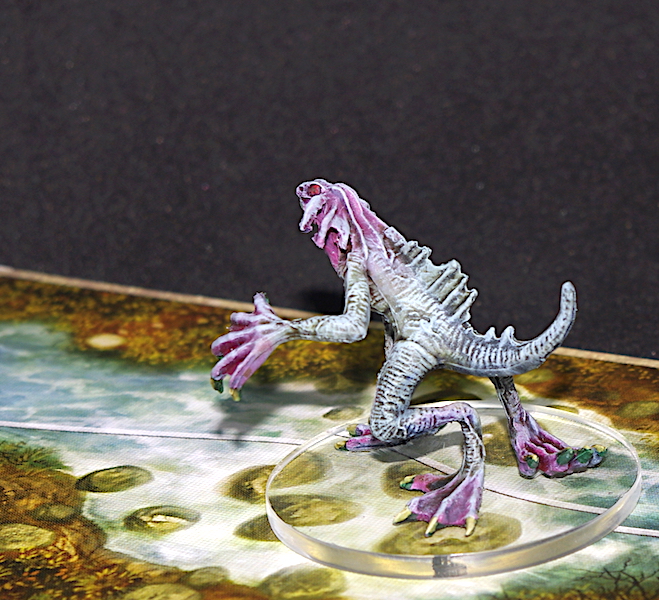
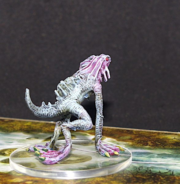
These were truly terrible miniatures, all warped and covered in mould lines, and I really had no enthusiasm to paint them, which showed in the final result. I gave them the hot water treatment to try and get their legs into a position where they were likely to stick on a base, but gave up on all the mould lines part way through and just let ’em be.
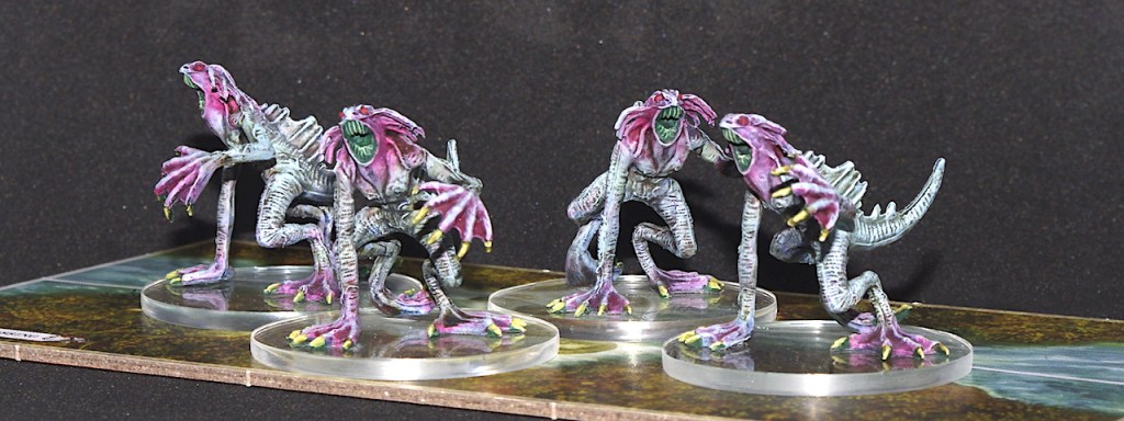
In terms of painting, I kept it quick and simple, with a Space Wolves Grey contrast over white prime, which was followed by an airbrush of Scale Colour’s Fuchsia and a glaze of Pale Blue. A liberal covering of Athonian Camoshade and Vallejo’s Red Wash, finished off with a Pale Blue and then Wolf Grey drybrush, and I called it a day, other than the few details like the teeth, nails, and eyes, which I didn’t waste much time on.
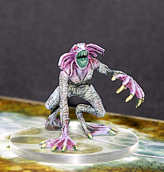
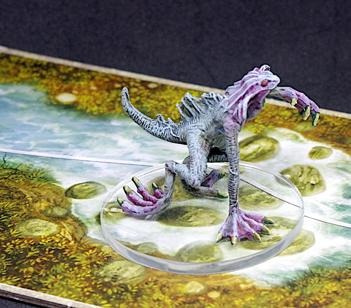
They are what they are, passable. They lack in contrast and are too pale – I think I should have gone with a darker red than the Fuchsia, and in my eagerness to get them done I was a bit too heavy with the drybrushing. Still, I’m sure they’ll look okay in play and it’s another four monsters down.
I’ve got my DSLR up and running again, but it’s still a bit erratic when it comes to focusing properly, and I’ve had to take loads of pictures to then pick out the ones where it worked – I think a proper service is called for!

Sometimes it’s hard to tackle a poor sculpt/ poorly-cast figure, but I would say you did an impressive job with these!
LikeLiked by 5 people
Thanks Dave. I find it hard to get motivated over poor sculpts, but when they need doing, they need doing 😔
LikeLiked by 2 people
You’ve done an awesome job on them, crap sculpts or not! I like the colours and I think the fuchsia looks really good as a contrast to the light blue-grey. If you think they’re too pale, what about a glaze with thinned blue or green wash? But on the whole they look a lot better than they deserve to 🙂
LikeLiked by 3 people
Thank you Matt.
I do think they look too pale, but you know, I also think they sort of fit with the murky water kinda place one would expect them to jump out of. I’ll see how they look when they come out in play… 🤔
LikeLiked by 2 people
I like the colours you’ve gone for Justin, it’s given them an almost translucent feel you see in some deep water fish.
LikeLiked by 3 people
Hey Dave, you’re right… I mean, that’s exactly what I was aiming for!😉
LikeLiked by 3 people
These sculpts really are about the worst. The soft plastic doesn’t help and the details just don’t really work well either. And then there’s the mold lines to boot! The Deep Ones are not fun to paint to be sure but they came out looking nicely and the even better news is that they’re done and you don’t have to paint more of them (hopefully)!
LikeLiked by 3 people
Yeah, they’re pretty shoddy, but as you say, they’re done, time to move on🙂
LikeLiked by 1 person
I think Dave Stone’s hit the nail on the head there! 🙂 I think they look fine myself. I’ve seen way worse looking mould lines than they seem to have!
LikeLiked by 2 people
Thanks John.
I did do a half-hearted job at removing some of the lines, but in the end I thought, ‘why am I doing this for such lousy figures,’ and called it a day!
LikeLiked by 1 person