
I enjoyed painting Kingpin, leader of the Criminal Syndicate, and I think he’s turned out pretty good, but I can’t take all the credit myself you know. For starters, he’s one of Yasmin’s roster and she decided on the version of Kingpin she wanted painting, which basically came down to her wanting him to have purple trousers (it is her favourite colour after all!).
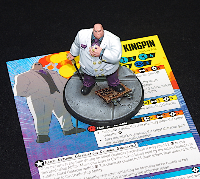
After casting a look around the web, I came across Sorastro’s version, showed this to her, and so that’s what I followed. I say followed, I copied his colour scheme for the trousers and shirt, though I didn’t use the exact same colours as he did. The flesh and his jacket were all my own ideas, judge that as you will!
The trousers I painted following the zenithal highlights from the priming. I used Heavy Violet mixed with a desaturated Dark Fleshtone. This gave a nice deep dark purple, which I’ll try to remember when I come to paint the colour again. I used ScaleColour’s Sunset Purple for the mid-tones, mixed with the above, and then used various fleshtones added to it to highlight.

I came across using fleshtones for mixers on Vince Venturella’s YouTube channel. He talks about universal highlighters, which involves mixing Caucasian flesh tones into the paint to create sympathetic highlights. It’s well worth a watch and it’s something I’ve started experimenting with it with good results.
The shirt was highlighted in a way I wouldn’t have normally done, as I usually go grey, but after following Soratsro’s scheme I think I’ll use the method again, as I really like how it came out – the blue ties in nicely with the purple and I decided to go with that when it came to his jacket…

Ah, yes, the jacket!
I had a few, self-made issues here. I decided to wet blend, but rather than do it how I’d normally do it – bit by bit, constantly toing and froing from one colour to the next – I decided to try something different. I applied some retarding medium to the actual area of the jacket I was going to paint, painted on the highlight, and then blended with the shade. I’ve seen it done before and works quite well, but I couldn’t get on with it, as I found it hard to judge when the paint was starting to dry and ended up leaving brush marks. In the end, I resorted back to my own, tried, and tested method but the finish isn’t as smooth as I’d like.

Something I’ve been trying to improve on is getting a smoother finish. I know my problem and that’s I’m always in too much of a hurry, I need to slow down, apply thinner coats and don’t be too quick in recoating.
For the colours of the jacket, I used blue greys to tie in with the other main colours, with only a final highlight in white.

Back to Kingpin and what else is worth a mention?
Well, all the metal areas, small though they be, I painted using NMM. Okay, they are small – rings, cane top, buttons, and cufflinks, but hey, it’s a start!

I spent a fair bit of time on his face, wet blending and glazing, and only actually used two colours, Pale Flesh, and Tan. I’m quite pleased with how it turned out, though I should have pushed the highlighting on the top of his head, given him a real shine, lol!

So, that’s Kingpin. Next up, as far as MCP is concerned is Sin and Viper. I’ve nearly finished Sin, but I want to go back and work on her flesh, as it isn’t pale enough for a red head! I’ve already completed a few Mansions figures and I’ll be posting these next(ish). Bolt Action is coming along, with a few vehicles assembled and, wait for it, six Soviet soldiers! Man, these things take some getting used to in terms of assembly, what with trying to line their arms up to accept the weapons… I mean, I’m an Aircraft Leckie and used to handling very small bits in places where you really don’t want to drop them, but these pieces are so tiny, I find them constantly pinging out from between my nails and landing on the grey bit of carpet under my desk. Yep, and they’re grey plastic too, so you can guess what I spend most of my time doing, can’t you?

Only final thing. How do the images look to you? I transfer then from my camera onto our Mac, as it’s got better software on there, and the pictures look bright and well colour balanced. But when I look at them on my laptop they look too dark. I’m sure I adjusted the Mac a while back, when I was more into photography, to give a truer representation of the image, but I do wonder how everyone else sees the images, because they also look great an my iPhone and iPad. I wonder, is it an Apple vs Microsoft thing, or just how the display interprets the colours?

Great work Justin, I’m sure Jasmin is happy with all you’ve done on it for her. With so many variations of Kingpin between comics, TV series and films, having one which is custom for Jasmin is a very cool idea.
When your experimenting with mixing your colours for highlights, try using bone, it can give a subtle highlight especially on clothes, I normally start with 2 parts base colour, to 1 part bone, but worth experimenting with what’s right for you
LikeLiked by 4 people
Thanks Dave.
I do use Bonewhite to add as a highlighter, that and Ivory. I have found, though, that using fleshtones doesn’t desaturate the colour as much and they’re especially good with reds.
So many ways to do the same kind of things; it’s fun to experiment and I’m sure everyone has their own little tricks up their sleeve😁
LikeLiked by 4 people
I just ran into this myself, accidentally. I had been highlighting with bone, Ivory, yellow, etc. and didn’t like the way the colors kept ending up very brown or grey. Then I was doing an experiment with a limited palette and worked in highlights with a flesh color and the highlights were looking much better. Didn’t even really realize what I had gotten into, but makes sense now!
LikeLiked by 2 people
Yes, I it works really well and you get a more natural shade, ideal for wet blending too!
LikeLiked by 1 person
Classic! Your daughter has good taste in comic-book characters! I think I’ve watch all the YouTubers you mentioned, and I draw some inspiration from they as well, but like you, I tend to fall back on my tried and true when I can’t get it just right!
LikeLiked by 5 people
Lol! Yeah, she picks some good ones🙂
I’m always trying new things, but yes, it’s good to be able to fall back on what you know when things don’t quite go to plan.
LikeLiked by 1 person
Excellent work here Justin – the photos look fine to me, but then I can’t compare them to the figures in hand, or properly take into account my own monitor settings. I’m very impressed by the white of Mr.Fisk’s jacket – extremely well done on that front!
LikeLiked by 5 people
Cheers Azazel.
I think its the contrast ratio of my two monitors – the purple trousers can hardly be hardly be seen against the background on my laptop, but is crystal clear on the Mac… or it could just be that I need to figure out the settings a bit better🤔
I was well pleased with how the jacket turned out in the end – I didn’t have high hopes at one point!
LikeLiked by 1 person
Very nice and I can echo Azazel’s comment on the jacket! 🙂 Pictures look fine to me (even though I’ve got a new Chromebook and I can’t get used to the screen settings being different from my old one)!
LikeLiked by 4 people
Thanks John.
I think it’s just my laptop monitor needs configuring properly, if I can remember how to do it that is!
LikeLiked by 1 person
Excellent work, Justin! The white of his jacket really pops, the skin tones are outstanding and the purple trousers definitely work! As for the photos, they look good to me, plenty of detail and colour and they’re in focus.
LikeLiked by 3 people
Cheers Matt.
Really pleased with the end results – one of my better ones methinks😁
LikeLike
Goodness me, he looks perfect. The clean-ness of his jacket is so good; even if you suffered from self-made problems it is clear that you overcame them. I also congratulate Jasmin on her good taste!
LikeLiked by 1 person
Thanks mate, very nice of you to say so.
I didn’t think the jacket was going to make it at one point and I spent a lot of time going over and over it to try and put it right.
Yes, Yasmin has much better taste than I do (I was forced to say that, as she was standing behind me😉).
LikeLike
The photos look sharp and well-lit to me. I think the jacket really came out nicely on this mini though the face also looks quite nice. This mini has a lot of “soft” features and couldn’t have been the easiest to get right so kudos to you for putting time into this one and trying to push your skills. I was especially happy to see the NMM buttons too 😀
LikeLiked by 1 person
Thanks Jeff.
I think I just need to figure out my colour settings on my laptop.
I knew you’d like my attempt at NMM – big things start small, eh!😁
LikeLiked by 1 person
Great looking mini, the white jacket and flesh came out beautifully! I think there was a version of Kingpin with pin-striped purple pants at one point. But that’s just asking for even more work!
LikeLiked by 1 person
Forgot to mention that Vince Venturella’s channel really helpful too. I forgot about Sorasto’s, which is also really good!
LikeLiked by 1 person
Yeah, I’ve watched many of his ‘Hobby Cheating’ videos, well worth a look. Soratro’s are more advanced, in that he has his own style and doesn’t always share exactly what he’s doing with you. His pieces always have a ‘glow’ about them, though sometimes this feels out of place, but his work is top notch.
LikeLiked by 1 person
I just so happen to be watching his color series on Hobby Cheating. Great stuff!
LikeLiked by 1 person
That’s a great series to watch and I’ve learnt a lot from it😃
LikeLiked by 1 person
Just checked out Sorasto’s MODOK video. That’s just mind blowing and also super intimidating. My mini is now getting shelved for a good long time!!
LikeLiked by 1 person
I do find it annoying at times, though, when he does something and says, ‘… like I did in video …’ which means you have to go hunting to find out how he did something, but yeah, some of his his stuff is way above my level😖
LikeLiked by 1 person
Thanks mate.
Ooo! I don’t think I fancy painting pinstripes… ever!
LikeLiked by 1 person
Really cool!
LikeLike